
Credit risk modelers are under pressure to improve the accuracy of default projections – and are increasingly using models driven by machine learning (ML) to achieve this goal. ML models, moreover, are also being employed by banks for everything from underwriting decisions to the building of scorecards and early warning systems to the development of internal ratings-based approaches to credit risk.
But while some of these models have proved superior to traditional credit risk approaches with respect to, say, linking risk drivers to target variables (e.g., “Default: Yes or No”), there is still one area where they have proved lacking: explainability.
Indeed, concerns about bias and explainability cut across all groups involved in ML modeling. Supervisors want details about how ML models work; users want to know why, say, a client was rejected by a model; the model validation team typically asks questions about the effect of each risk driver; and the head of model risk management wants to know which risk factors have the greatest impact.
These are difficult issues to address, after one has journeyed from logistic regression to the world of random forests, support-vector machines and gradient boosting. However, there is no question that improving explainability is now a focus of the ML modeling community. Developers, in fact, have added visualization modules to existing ML libraries that are specifically designed to augment explainability.
Shapash, developed by the French insurance company MAIF, is one example of a visualization tool that can be added to an ML model. Let’s now take a closer look at how this tool works, what kind of output it generates and whether it fulfills expectations around better explainability.
A “Titanic” Example: How to Use ML and Shapash
To test the efficiency and explainability of ML models, modelers sometimes dissect data from famous historical events. Using datasets from the Titanic shipwreck to predict survival rates for different groups of passengers is a classic example of this approach. The predictive ML models used for these forecasts are typically supplemented with visualization tools, like Shapash, to make them more interpretable and explainable.
To get some hands-on experience with Shapash, I recently downloaded GitHub’s Titanic survival dataset. It includes the details of a subset of 891 Titanic passengers, and unveils whether they survived.
Marco Folpmers
How can one use this information to understand whether a visualization tool can improve the explainability of an ML model? It’s essentially a four-step exercise: (1) splitting the dataset into a training set and a test set; (2) training the ML model on the training set; (3) deriving the performance statistics from the test set; and (4) using Shapash (on the test set predictions) to get a better insight into the inner workings of the ML model.
In the final step, the Shapash library, when added to a fitted ML model, allows one to use the passenger characteristics (e.g., sex, age and passenger class) to visualize their impact on the probability of them surviving the Titanic shipwreck.
Subsequent to splitting the dataset, the ML model is fitted using the lightgbm classifier routine. Using this approach, we can quickly reach a survival probability accuracy rate of between 75% and 80% for our test set, without any feature engineering (correct predictions divided by total number of predictions).
When applied to the test set, the fitted model is used as input for Shapash. At this stage, for our test set of Titanic passengers, Shapash can produce so-called “features importance scores.” These scores are derived from the ML routine by checking by how much the performance of the model would deteriorate if a specific characteristic (e.g., age, sex or passenger class) would have been omitted. They are then translated to standardized scores, summing to 100%.
Figure 1: Relative Impact on Model Performance – By Characteristic 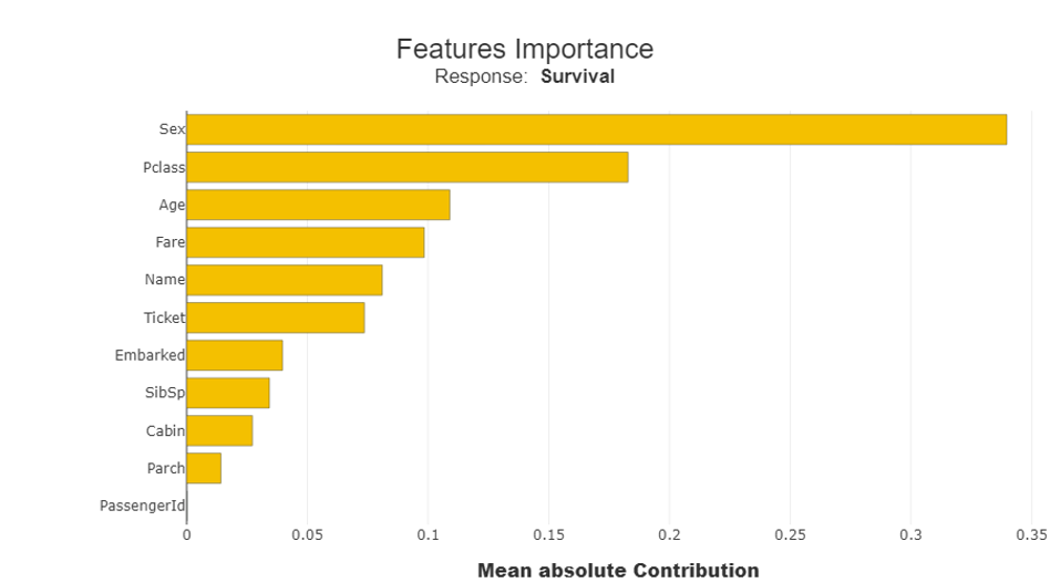
We can use the data in Figure 1 to conclude that sex, passenger class and age are the main contributors to the predicted survival probabilities for Titanic passengers.
After taking a broader look at multiple passenger characteristics (Figure 1), we can then analyze a single characteristic – age. In Figure 2 (below), we see that characteristic expressed at the level of the individual observation, rather than the overall model level. This is sometimes called “local explanation,” since the importance of a specific characteristic (or “feature”) on the survival probability of a single observation is investigated.
Figure 2: Titanic Survivor Probabilities, By Age
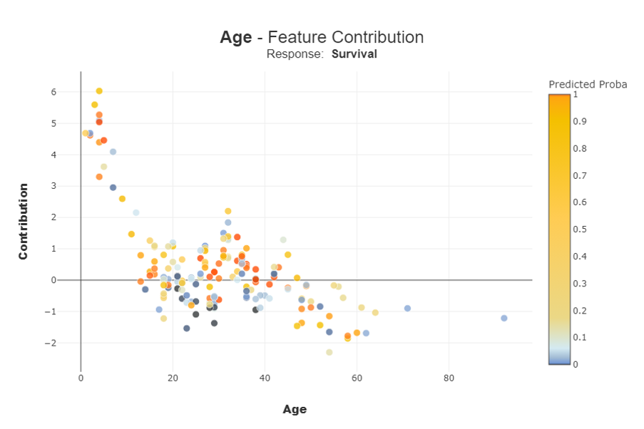
Each dot in Figure 2 represents an individual passenger that has either survived or perished. On the X-axis, we see the age of each passenger. The color of each dot indicates the survival probability, as calculated by the fitted ML model (the redder, the higher the assigned survival probability). The importance of the feature (age in this example) for the determination of the survival probability is expressed for each passenger on the Y-axis as a local contribution.
Figure 2 provides enlightening data on four primary age groups: small children (under five years old); children and young adults between five and 20; adults at a “robust age” (between 20 and 40); and the “elderly” (anyone over 40, in our scenario). We won’t go here into a full analysis, but let’s focus on the general trend.
The age characteristic is a key contributing factor to the predicted survival rate for small children, while for older passengers we see a non-linear pattern peaking at the midpoint of “robust age.” From the color coding, we can derive that a higher contribution does not translate directly to a higher predicted probability of survival: e.g., in the range of the small children, we see some dark blue dots (low survival probability). Contrarily, we see some bright red dots (high survival probability) for the elderly. But why?
Well, for the elderly with the high (predicted) survival rate, the Shapash visualization tool demonstrates the importance of other characteristics (e.g., women who were in the privileged passenger class) that led to a high probability of survival.
This situation can also apply to credit risk, where the age driver often has a non-linear impact on the default indicator. One often sees lower default rates at the robust age and higher default rates for younger persons and the elderly, leading to the typical “bathtub survival analysis.” Similar to the Titanic survivor probability example, many different characteristics (aside from age) can have an impact on default risk.
The Shapash visualization tool can also be used to show how one characteristic impacts another. In the case of the Titanic, for example, you can look at a single feature (e.g., age) and demonstrate how it impacted survival probability when combined with other characteristics. This further enhances “local explanation.”
Figure 3 depicts the high survival probability for one specific elderly person: a woman from a privileged passenger class.
Figure 3: Titanic Passenger #195 – An Example of High Survival Probability
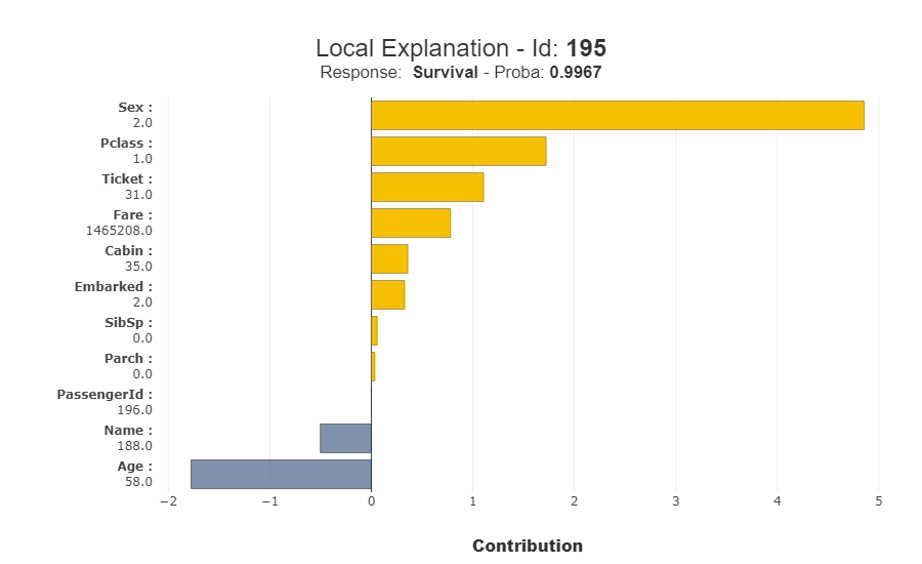
Based only on age, we would expect that the model would determine a low survival probability for this passenger. However, thanks to the other, favorable characteristics of the individual (she was a woman who belonged to a privileged passenger class), a high survival probability (99.7%) is established.
Parting Thoughts
So, where do we stand as credit risk modelers with respect to visualization tools that supplement ML? The idea, of course, is to make it easier to interpret and explain ML models, and any tool that advances this cause is welcome – even if it’s far from perfect.
Shapash is attractive for at least two reasons. First, it produces very strong visualizations that provide a better understanding of the model. Second, it allows for a methodical inspection of the model. In our Titanic example, it moves from a high-level inspection of multiple characteristics (Figure 1) to a deep dive at the single characteristic (age) level (Figure 2), and, finally, to a local explanation (Figure 3) that shows how specific characteristics interact for one specific observation.
However, for credit risk modelers, the path to explainable ML is a journey – and there is still a long way to go. Modern visualization tools do not really give insights into the inner working of the model. In our Titanic example, Shapash doesn’t help us understand, exactly, the non-linear relationship between age and survival. Moreover, while the library’s interaction plots shed some light on the higher-order interplay between the characteristics of Titanic survivors, the credit risk community needs more transparency and explainability.
The current ML modeling set-up is very much oriented toward maximizing performance; explainability is only a secondary concern. This does not fit the needs of the credit risk modeling profession.
Credit risk professionals using ML models may be willing to sacrifice a bit of performance for better model explainability. This will require a next generation of both explanatory visualization tools and modeling algorithms.
Dr. Marco Folpmers (FRM) is a partner for Financial Risk Management at Deloitte the Netherlands.
Topics: Tools & Techniques